")
Introduction
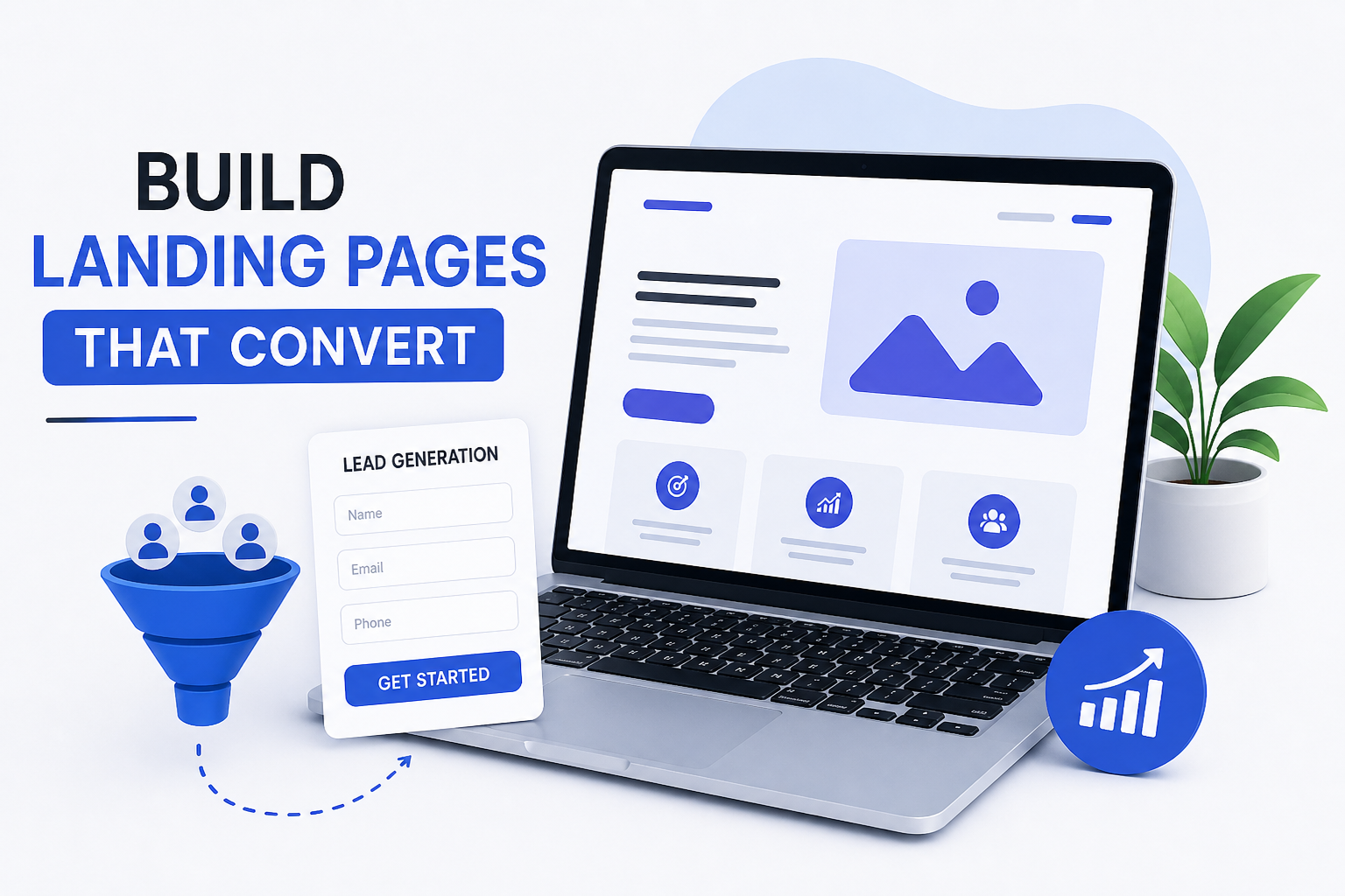
A landing page is not just a design element. It is a conversion tool. Most businesses invest heavily in ads, SEO, and social media traffic, but fail to convert visitors into leads or customers because their landing page lacks clarity, focus, and structure.
If your landing page is not built with a clear objective and user psychology in mind, you will lose potential customers regardless of how much traffic you generate. This guide explains how to build a landing page that converts using proven strategies and practical implementation steps.
What Is a Landing Page?
A landing page is a standalone web page created with a single goal: to drive a specific action from the visitor. Unlike a homepage, which contains multiple navigation paths, a landing page removes distractions and focuses on one outcome.
This outcome can be collecting leads, generating sales, booking consultations, or encouraging downloads. The entire layout, content, and design are built around this single objective.
Why Most Landing Pages Fail
Most landing pages fail because they try to do too much or communicate too little. When a user lands on your page, they decide within seconds whether to stay or leave.
Common reasons include:
- Lack of a clear value proposition
- Weak or generic headline
- Too many distractions or links
- No trust signals or credibility
- Poor mobile optimization
- Slow loading speed
These issues create confusion and reduce user confidence, directly affecting conversions.
High-Converting Landing Page Structure
A landing page that converts follows a logical flow. Each section should guide the user toward taking action.
1. Clear and Compelling Headline
The headline is the first thing users notice. It must clearly communicate what you offer and why it matters.
A strong headline focuses on a result or benefit rather than a vague statement. It should immediately answer the user’s question: “What do I get from this?”
Example:
Instead of saying “Welcome to Our Website,” use “Get More Leads with a Conversion-Focused Landing Page Strategy.”
2. Supporting Subheadline
The subheadline provides additional context to the main headline. It explains how you will deliver the promised result.
This section should remove any ambiguity and reinforce the value proposition.
3. Hero Section (Above the Fold)
The hero section is the first visible part of the page. It must deliver clarity instantly.
A well-structured hero section includes:
- Headline
- Subheadline
- Primary call-to-action
- Relevant visual (image or video)
The goal here is to capture attention and guide the user toward the next step without distraction.
4. Single Clear Call-to-Action (CTA)
A landing page should have one primary action. Multiple CTAs with different messages confuse users and reduce conversions.
Your CTA should be:
- Clear and action-oriented
- Visually prominent
- Repeated at key sections of the page
Examples include “Get Free Audit,” “Book a Consultation,” or “Start Now.”
5. Focus on Benefits, Not Features
Users are not interested in what you offer; they care about how it helps them.
Instead of listing services, explain the outcome:
- Increased website traffic
- Higher conversion rates
- More qualified leads
This shift from features to benefits makes your message more persuasive.
6. Social Proof and Trust Signals
Trust is a critical factor in conversion. If users do not trust your brand, they will not take action.
Effective trust elements include:
- Client testimonials
- Case studies with measurable results
- Reviews and ratings
- Client logos
Providing real proof of results builds credibility and reduces hesitation.
7. Problem and Solution Section
This section connects with the user’s pain points and positions your offering as the solution.
Clearly define the problem your target audience is facing and explain how your service or product solves it. This creates relevance and emotional engagement.
8. Simple and Optimized Lead Form
Your form should be easy to complete. The more fields you add, the higher the drop-off rate.
Best practices include:
- Keep only essential fields (Name, Email, Phone)
- Use a clean layout
- Avoid unnecessary friction
The objective is to make the conversion process as smooth as possible.
9. Urgency and Scarcity
Users tend to delay decisions unless there is a reason to act immediately.
Adding urgency elements such as limited-time offers or limited availability encourages faster action. This increases conversion rates without changing the core offer.
10. Mobile Optimization
A large percentage of users access landing pages from mobile devices. If your page is not optimized for mobile, you will lose a significant portion of your audience.
Ensure that:
- The layout adapts to smaller screens
- Buttons are easy to tap
- Text is readable
- Loading speed is fast
Landing Page Design Best Practices
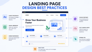
Design plays a supporting role in conversion. It should enhance clarity, not distract users.
Key principles include:
- Use white space to improve readability
- Maintain strong contrast for CTA buttons
- Use consistent typography
- Avoid cluttered layouts
- Optimize images and assets for speed
A clean and focused design improves user experience and keeps attention on the main goal.
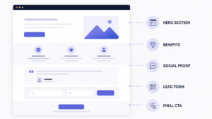
Example of a High-Converting Flow
A well-performing landing page typically follows this structure:
- Headline with clear value
- Subheadline for clarity
- Primary CTA
- Benefits section
- Social proof
- Problem and solution explanation
- Lead form
- Final CTA
This structured flow guides users logically toward conversion.
Common Mistakes to Avoid On Landign Page
Avoid these critical errors:
- Writing long, unclear content
- Using weak or generic headlines
- Adding multiple CTAs with different actions
- Ignoring mobile optimization
- Not including trust signals
- Having slow page loading speed
Each of these reduces the effectiveness of your landing page.
Advanced Conversion Optimization Tips
Once your basic structure is strong, you can improve performance further:
- Conduct A/B testing for headlines and CTAs
- Use heatmaps to track user behavior
- Add exit-intent popups
- Improve page loading speed
- Continuously refine messaging based on data
These techniques help you optimize your page based on actual user behavior rather than assumptions.
Conclusion
A landing page that converts is built on clarity, focus, and user psychology. It is not about adding more elements but about structuring the right elements effectively.
If your landing page clearly communicates value, builds trust, and guides users toward a single action, it will generate consistent results. If it fails in any of these areas, conversions will suffer regardless of traffic volume.
Call to Action
If your landing page is not generating leads, the problem is not traffic—it is conversion.
Get a detailed audit from Me2Digital and identify exactly what needs to be fixed to improve your results.

